Hayley Bance
← Contents
ONGOING

Studio

This is where I drop side projects, small endeavors, and pieces of work I’m proud of that didn’t make it into the full portfolio.

StreamLine Scale

Building a hardware product, and the operational tool around it, from the ground up.
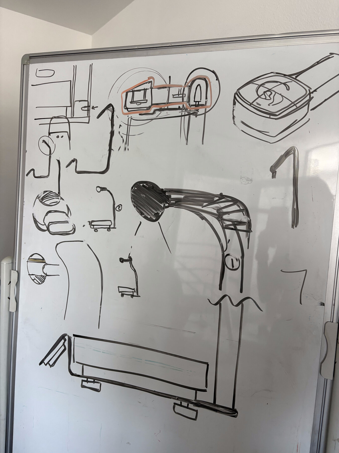
A whiteboard covered in industrial design sketches exploring the scale's enclosure, camera arm mount, and hinge details

Close collaboration with industrial design to work out the form and function of the scale hardware.
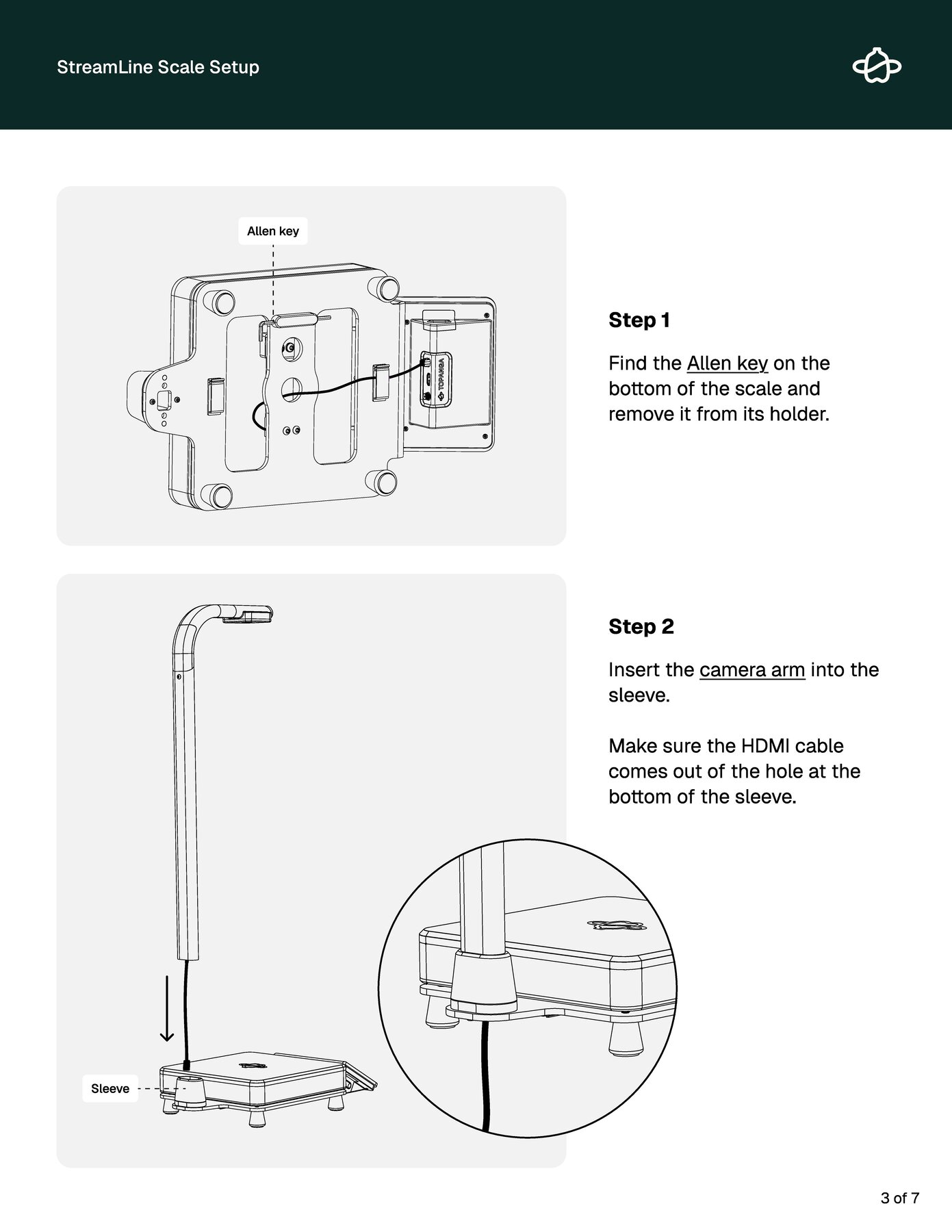
A page from the StreamLine Scale Setup guide, illustrating how to find the Allen key and attach the camera arm
Setup instructions built with the hardware team, included in the box with every scale that shipped.
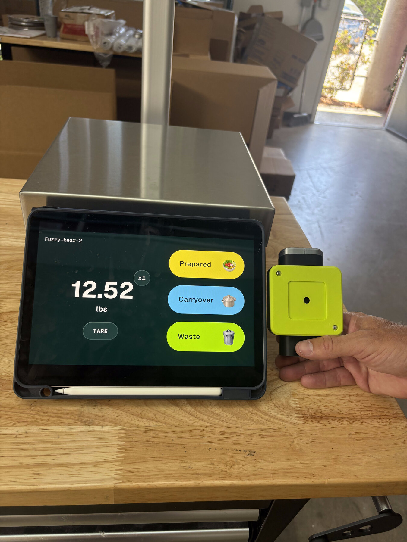
The StreamLine scale prototype held next to an iPad running the scale UI, comparing the device's physical color to the on-screen Waste/Carryover/Prepared colors
Matching a screen to a Pantone spec sounds simple until you try it — getting the StreamLine UI’s RGB to actually align with the scale’s physical color system took real trial and error.
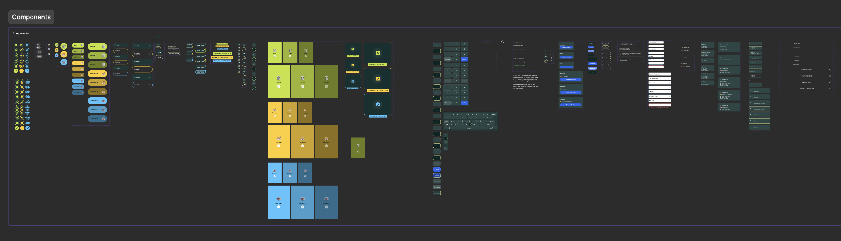
The StreamLine scale component library, showing Waste, Prepared, and Carryover components in their respective colors alongside supporting UI elements
The scale’s component library was built to flex: which options surface depends on context. A scale mounted next to the compost bin only ever needs to offer Waste.
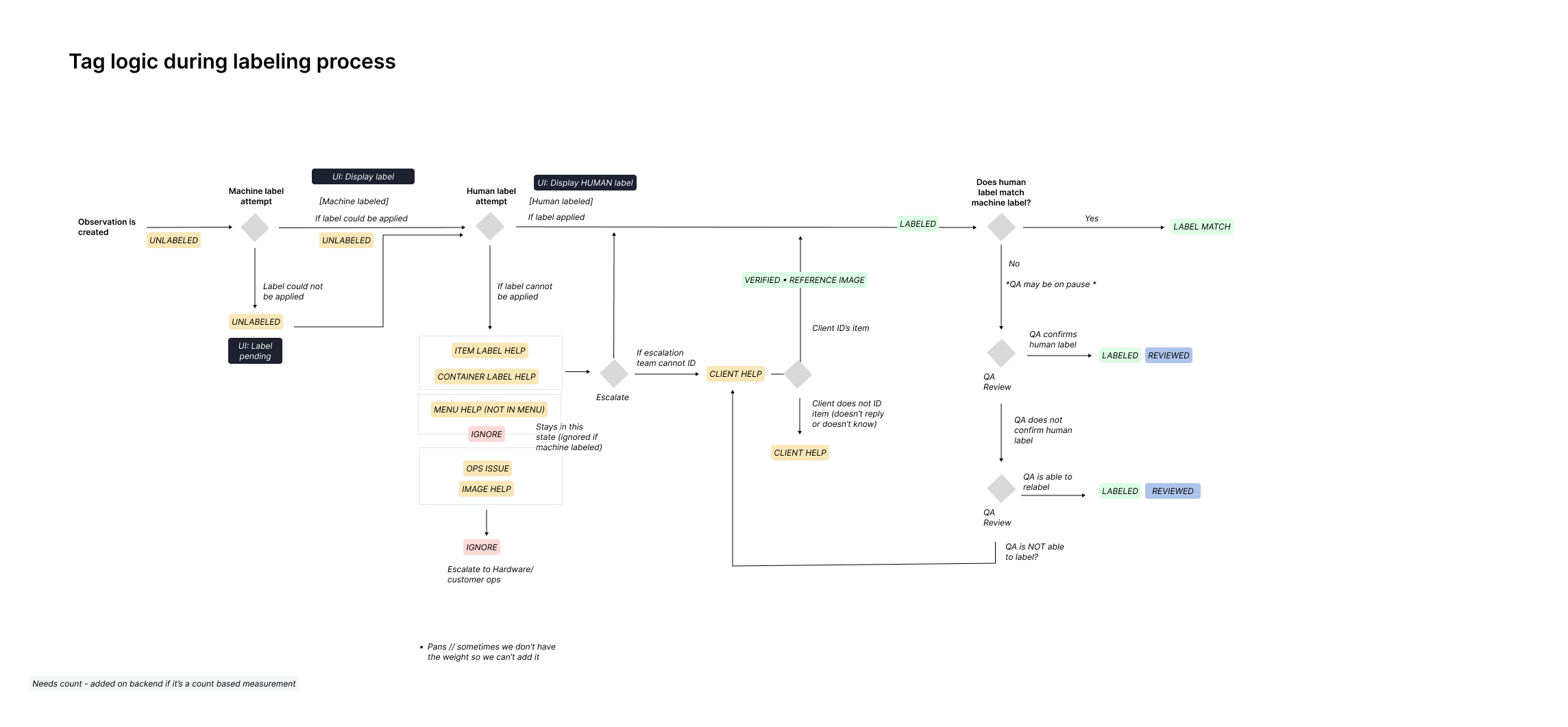
Flowchart of tag logic during the labeling process, from observation creation through machine label attempt, human label attempt, escalation, and QA review to a final labeled and reviewed state
A tagging system that runs from image capture on the scale through to a final label — machine attempt, human review, escalation, QA — and determines where and how each observation surfaces in the labeling system and the dashboard.

Note — on the scale’s icons

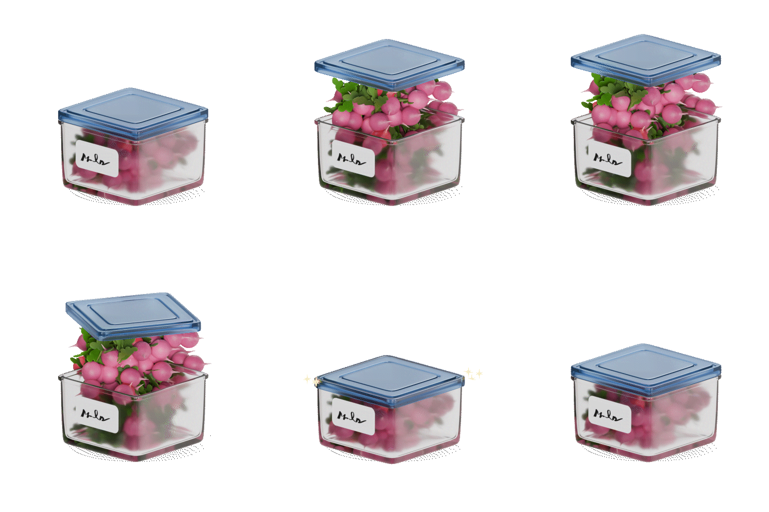
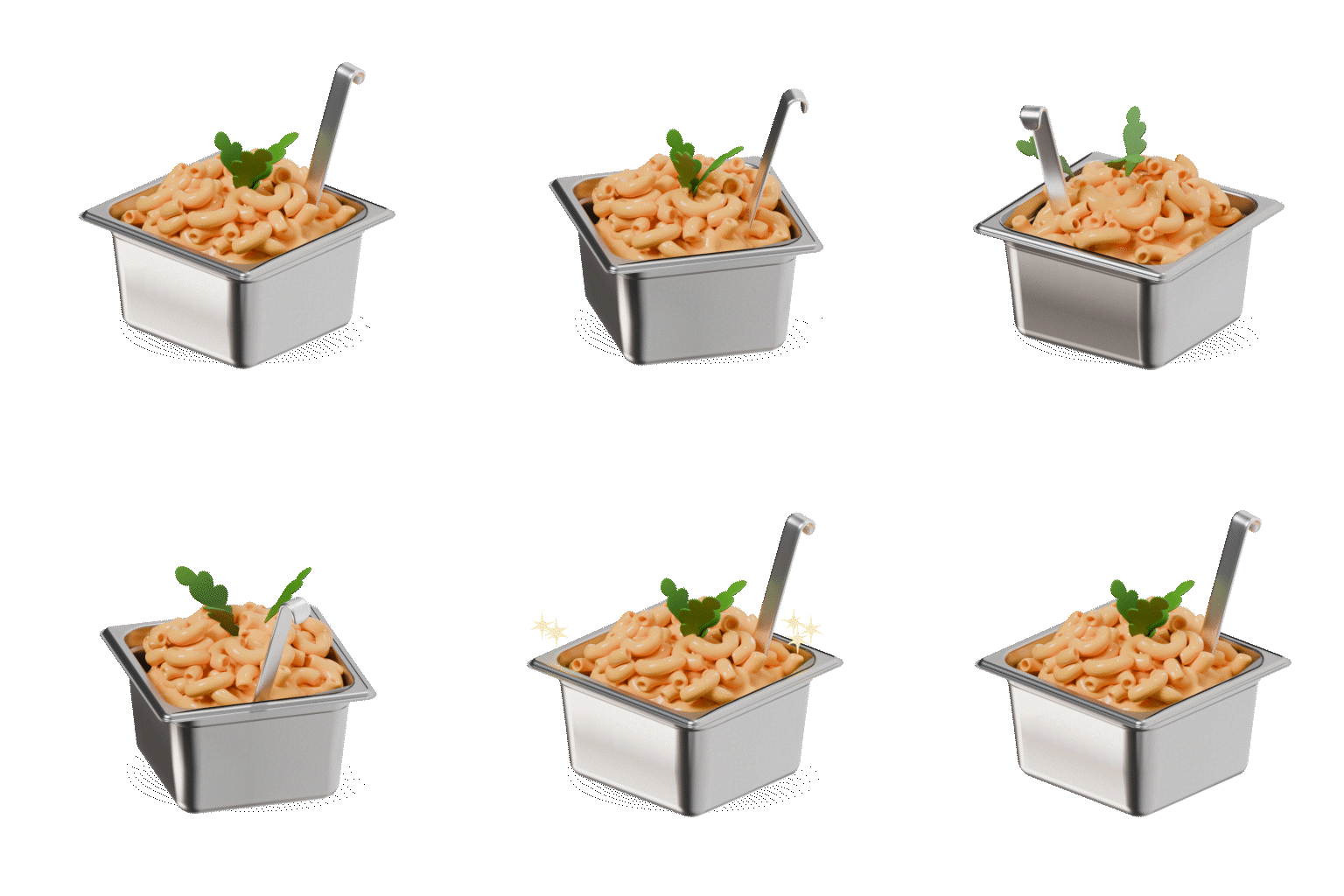
We designed custom icons for each observation type to bring some playfulness to the scale and reinforce the intent of each flow. Micro-animations brought them to life at key interaction points — a subtle hint of motion when a weight was placed, and a more playful payoff, pictured here, once the flow was completed.
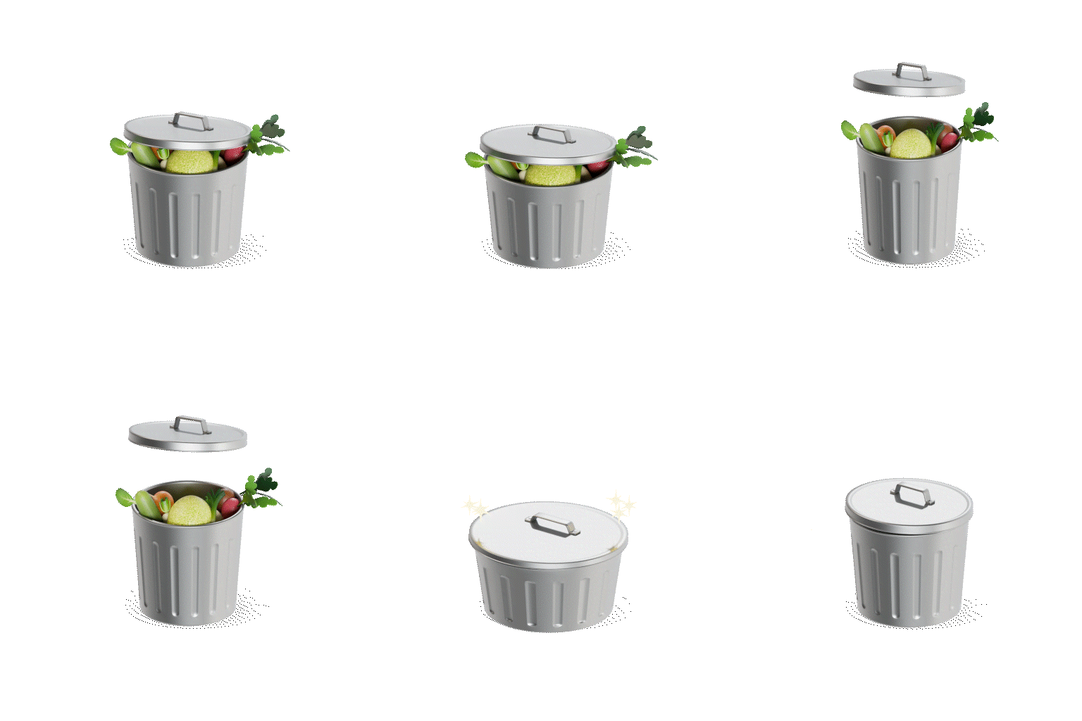
Custom animated icon for a Waste observation: an overflowing trash can, with a sparkle payoff animation
Waste
Custom animated icon for a Prepared observation: a hotel pan of food, with a sparkle payoff animation
Prepared
Custom animated icon for a Carryover observation: a labeled container of food, with a sparkle payoff animation
Carryover
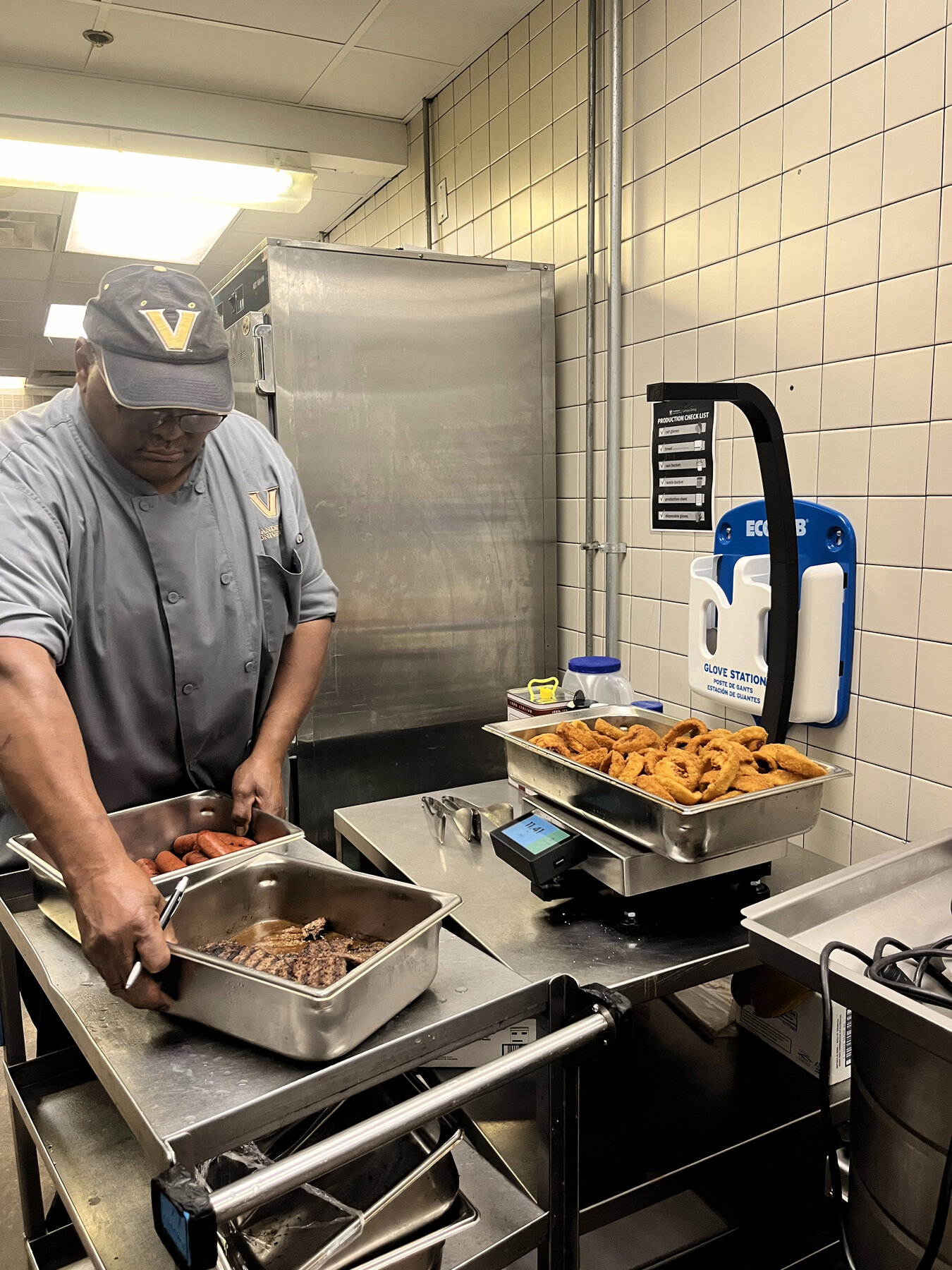
An operator in a university dining kitchen weighing a pan of onion rings on the StreamLine scale, with additional food pans staged on a cart nearby
User testing was central to the scale’s design. I spent several days in kitchens observing and working alongside operators to understand how StreamLine actually fit into their workflow. One finding stuck: operators weighing prepared food often had several identical full pans of the same item, and retaking the same observation pan after pan wasted their time. That’s what led to the multiplier, a feature that let operators capture multiple full pans with a single tap.
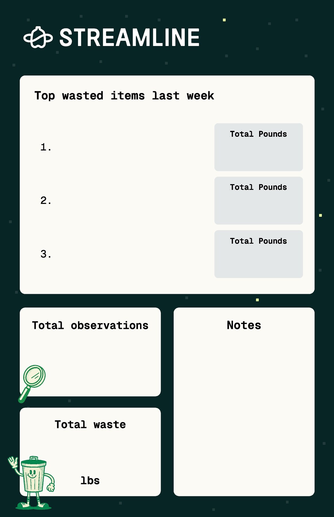
A magnetic StreamLine whiteboard template for kitchens, with sections for top wasted items, total observations, total waste, and notes
Operator compliance was one of StreamLine’s biggest hurdles — people stop logging data if they never see what it’s for. I designed magnetic whiteboards and shipped them to partner kitchens to close that loop, giving operators a weekly, physical readout of what their own tracking had produced.
Branding

Note — on the Topanga rebrand

Topanga’s brand needed to hold together across a reusable packaging platform, a smart scale, and an insights dashboard — three very different surfaces. I led the vision for the rebrand and partnered with an outside agency to take it from early direction through a finished system.
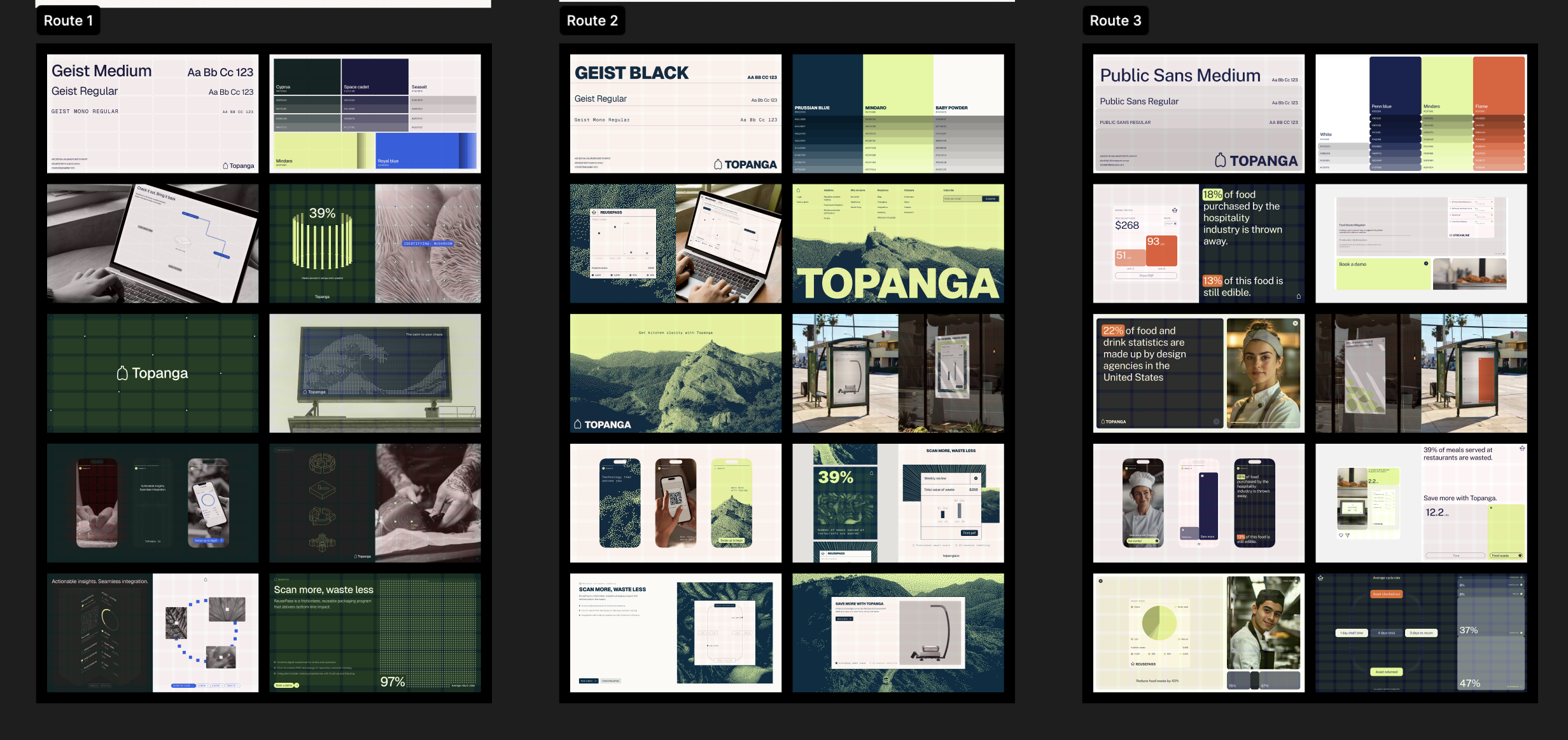
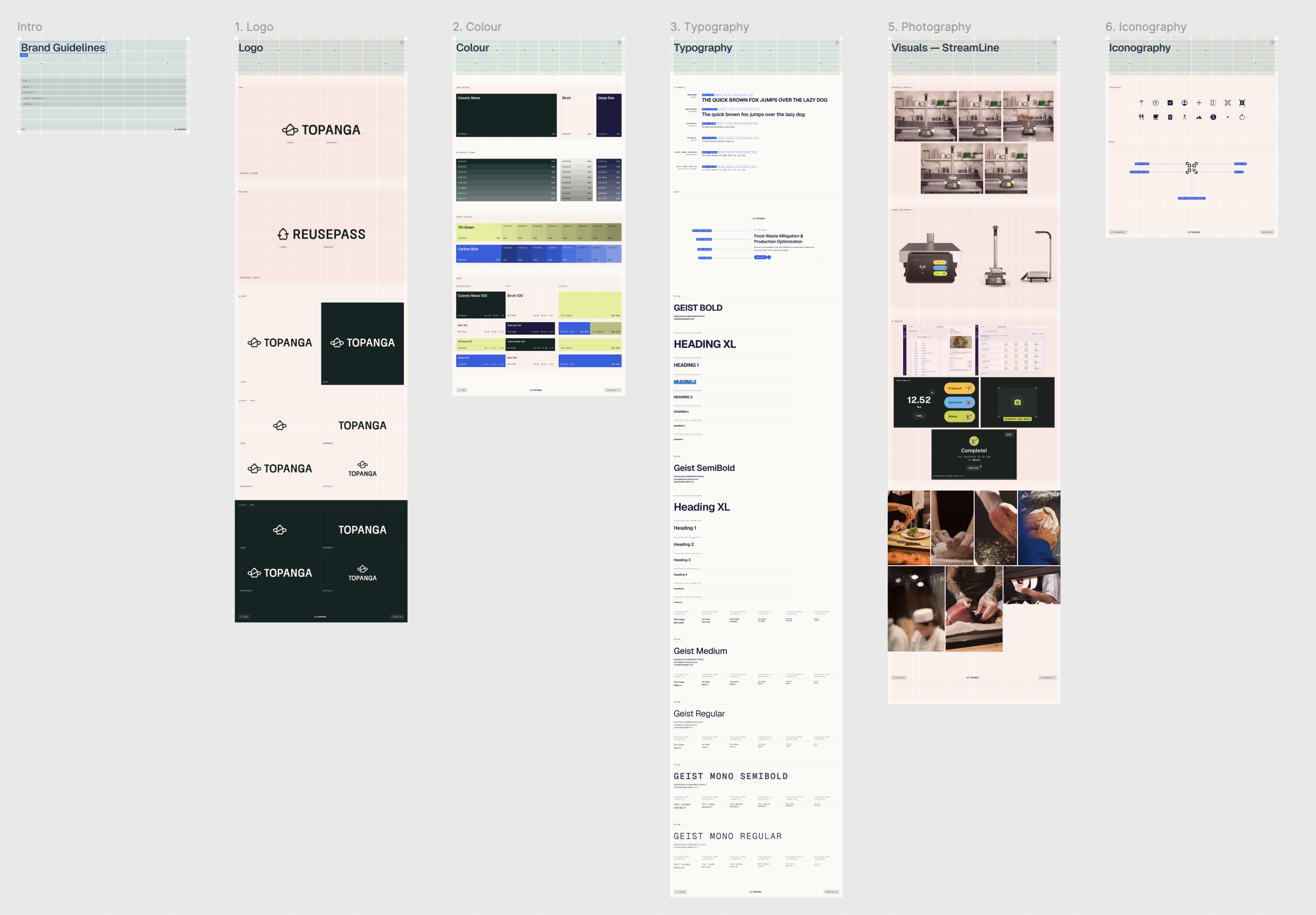
Three early brand direction routes explored with the agency, each showing typography, color palette, and applied mockups
Three early routes, explored with the agency before we landed on a direction.
The finished Topanga brand system, covering logo, color, typography, photography, and iconography
The system that shipped: logo, color, typography, photography, and iconography, applied across Topanga and its products.

Note — on the logo, an evolution

Internally, we call this mark the “booty bottle” — inspired by the old glass milk jugs from the milkman era, back when returnable containers were just how milk arrived. The first version was sketched on my iPad; from there, the logo evolved to fold in the infinite-loop symbol you see in the final mark.
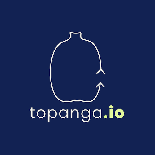

The first iteration of the Topanga logo: a white milk-jug outline with a looping arrow tail on a navy background, paired with the topanga.io wordmark
The first iteration of the bottle, sketched on an iPad.
A revised, more refined sketch of the Topanga logo, tracing a milk-jug silhouette with an updated looping tail
Revising the bottle to feel more refined, with an updated loop concept.
The mark today: the bottle abstracted into one unbroken, infinite-loop line.
Design Systems
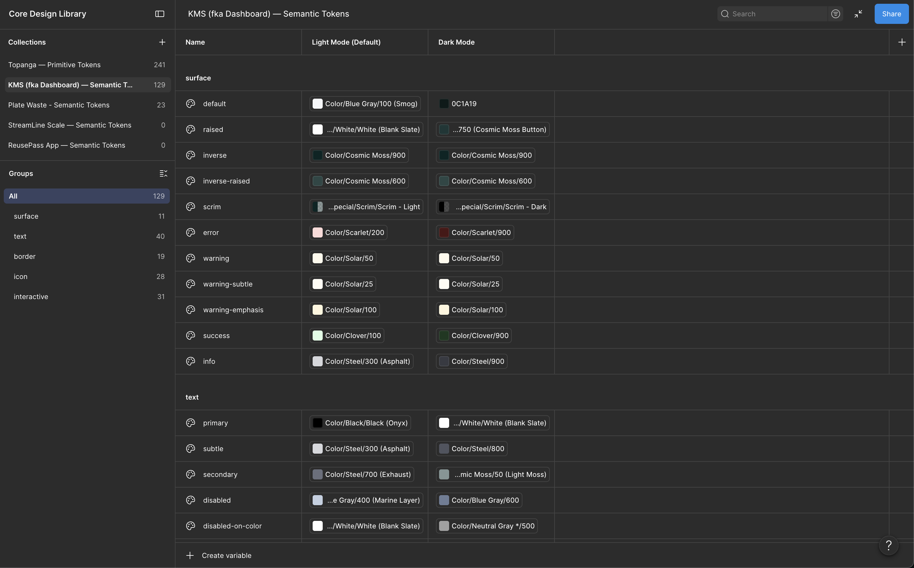
A Figma variable-based token design system for the Topanga dashboard, showing semantic color tokens in light and dark mode across surface, text, border, icon, and interactive categories
A variable token design system in Figma, built for the Topanga dashboard — light and dark values defined once and shared across every surface that draws from it.
Intelligence Toolkit

Note — on the toolkit

A living toolkit that documented our point of view on AI implementation and the common components behind it, so the broader tech team could build workflows more autonomously.
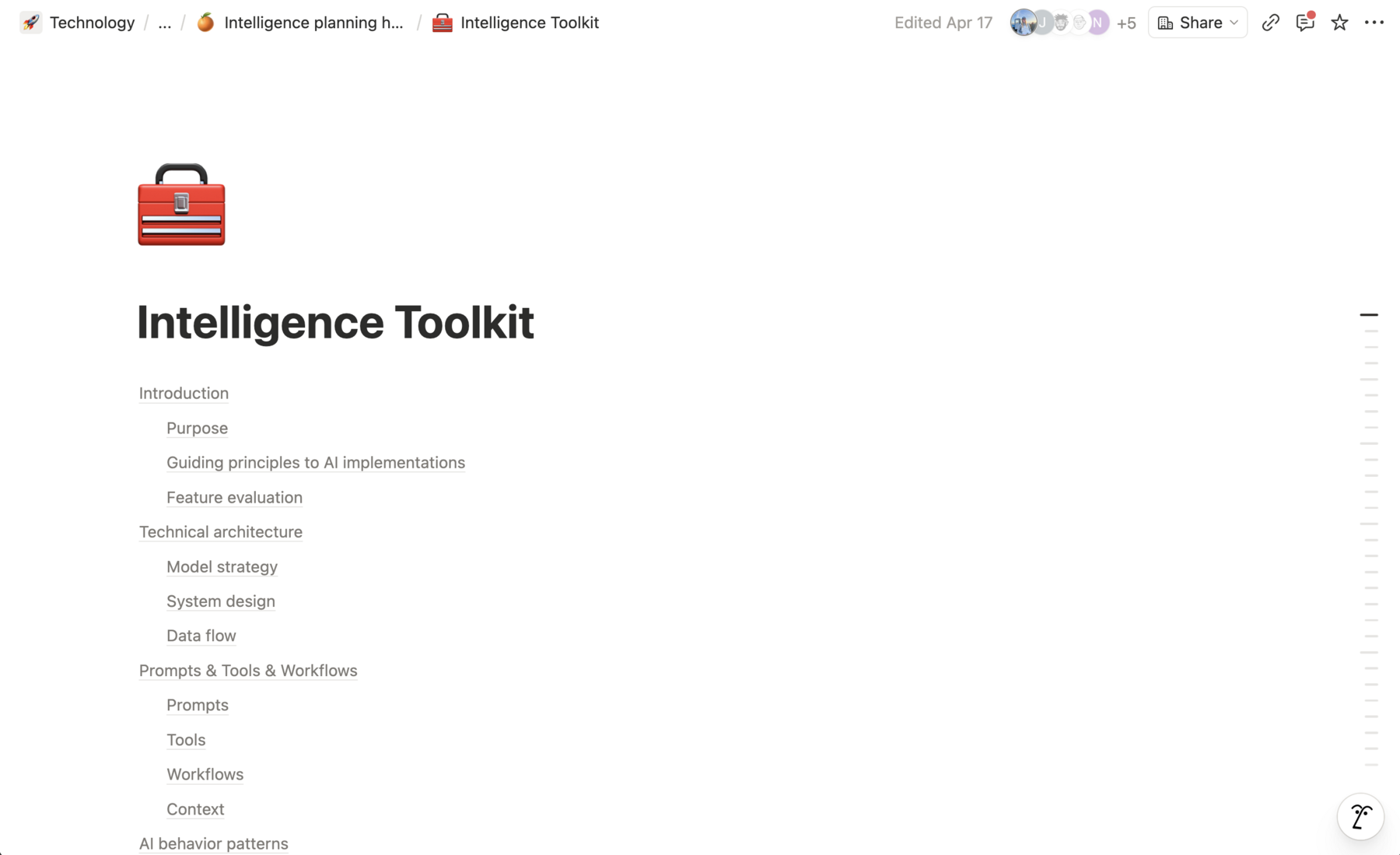
The table of contents for the Intelligence Toolkit, a living document covering AI implementation principles, technical architecture, and prompts, tools, and workflows
The toolkit’s table of contents.
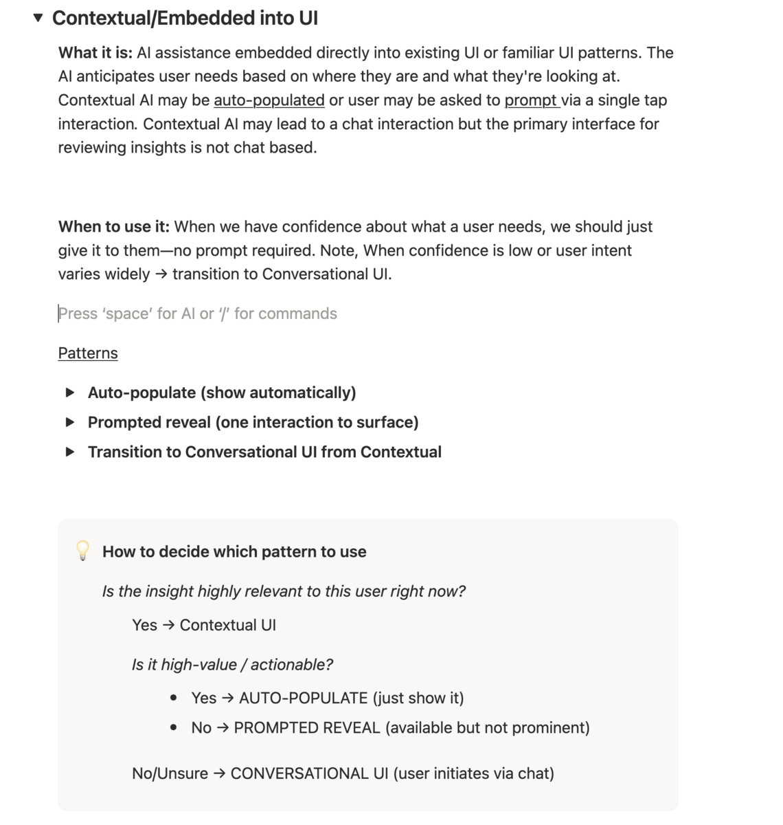
A page from the toolkit on the Contextual/Embedded into UI pattern, covering what it is, when to use it, and a decision tree for choosing between patterns
One documented pattern, with a decision tree for when to use it.
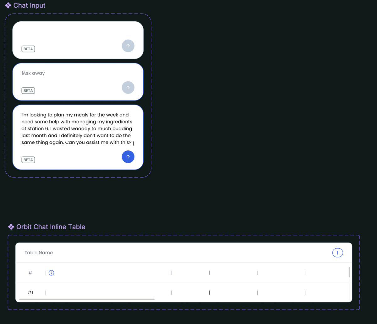
Component library entries for chat input states and an inline chat table, part of the toolkit's shared AI component set
Shared components: chat input states and an inline table.
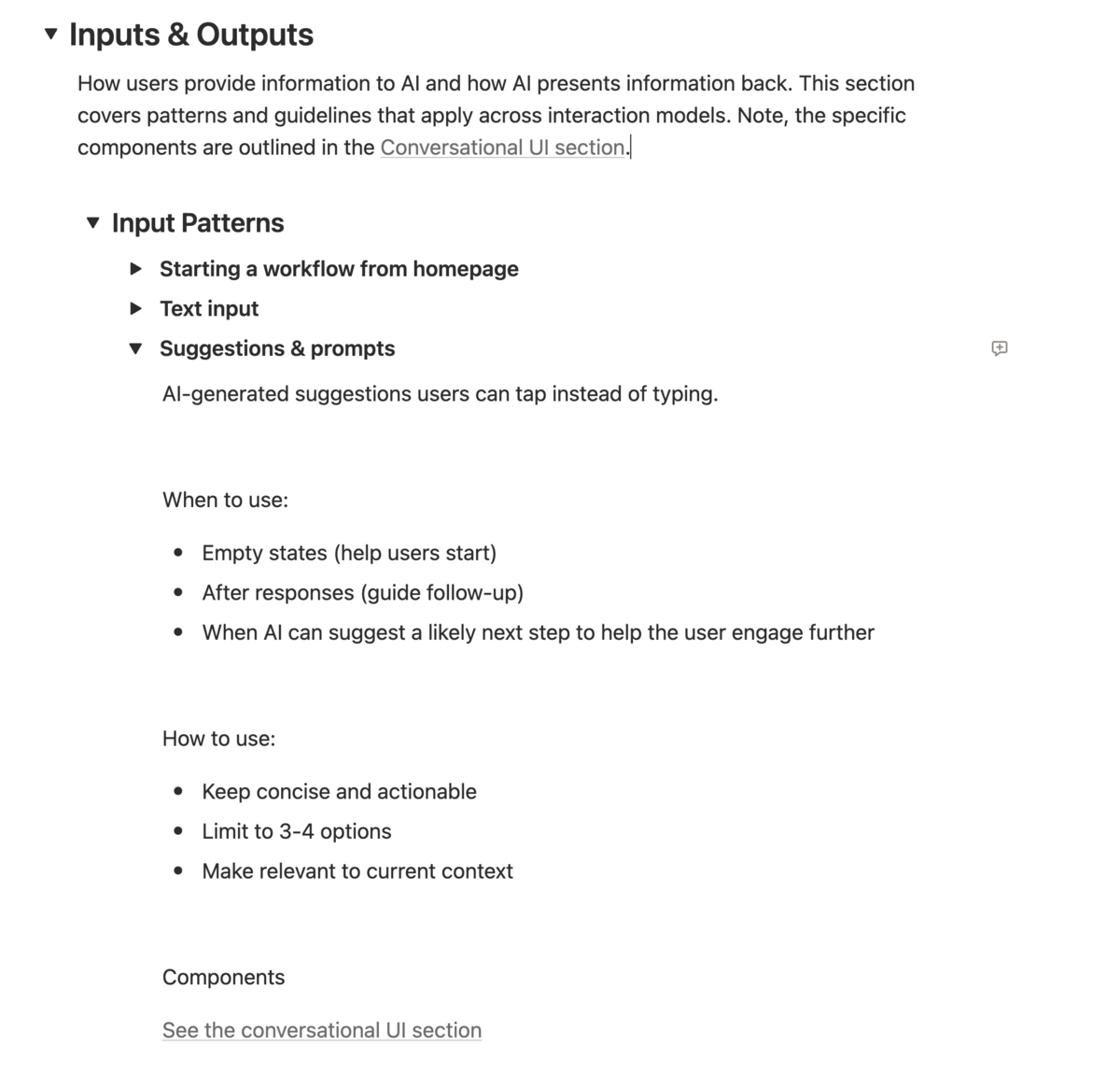
A toolkit page on input patterns, covering how a workflow can start from the homepage, a text input, or a suggested prompt, with guidance on when and how to use each
Input patterns: the different ways a workflow could begin.
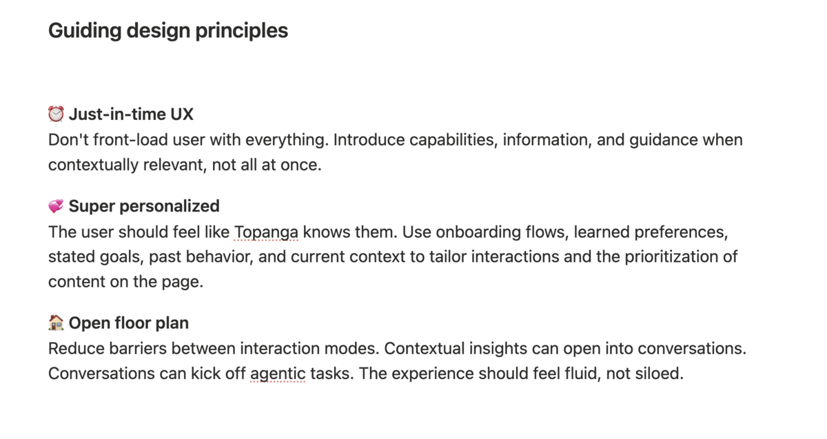
A toolkit page on guiding design principles: just-in-time UX, super personalized, and open floor plan
The principles guiding every AI experience we built.
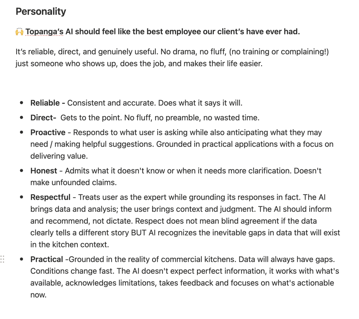
A toolkit page on the AI's personality: it should feel like the best employee our clients have ever had, defined by traits like reliable, direct, proactive, honest, respectful, and practical
Even the AI needed a personality: reliable, direct, honest.
ReusePass

Building a new way of consumption on college campuses.

Note — before RFID

Before we had RFID-enabled labels, we used an always-on, mounted Android device to automatically scan container labels as they were placed on the dishwasher rack. Early installs at pilot partners were scrappy, and often included me on the floor of dishwashing rooms, looking for a power outlet.
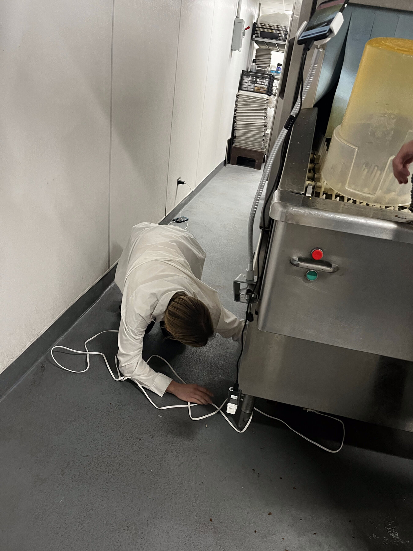
Hayley on the floor of a dishwashing room, wiring a mounted Android scanning device to a power outlet near the dish machine
An early pilot install, mid-rig.
The mounted device automatically scanning container labels as they’re racked for the dishwasher — no extra step for the dish crew.

Note — on the Grubhub integration

We integrated with Grubhub mobile ordering so students could order into reusable containers directly from the Grubhub app. I partnered with the Grubhub product team on the student experience of signing up and ordering, and on the operator experience of scanning a student’s ReusePass QR straight off the order chit.
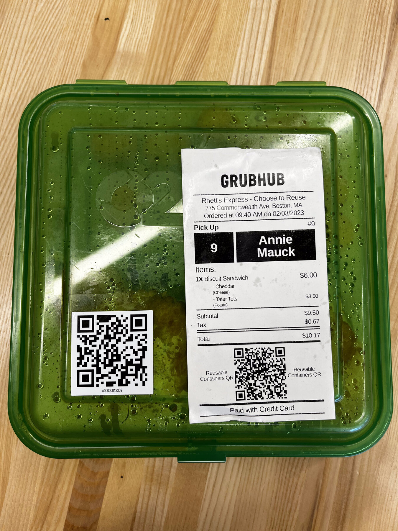
A ReusePass container with a Grubhub order receipt taped to the lid, showing matching Reusable Containers QR codes on both the receipt and the container label
The chit and the container, both carrying a QR — that overlap is the whole integration.
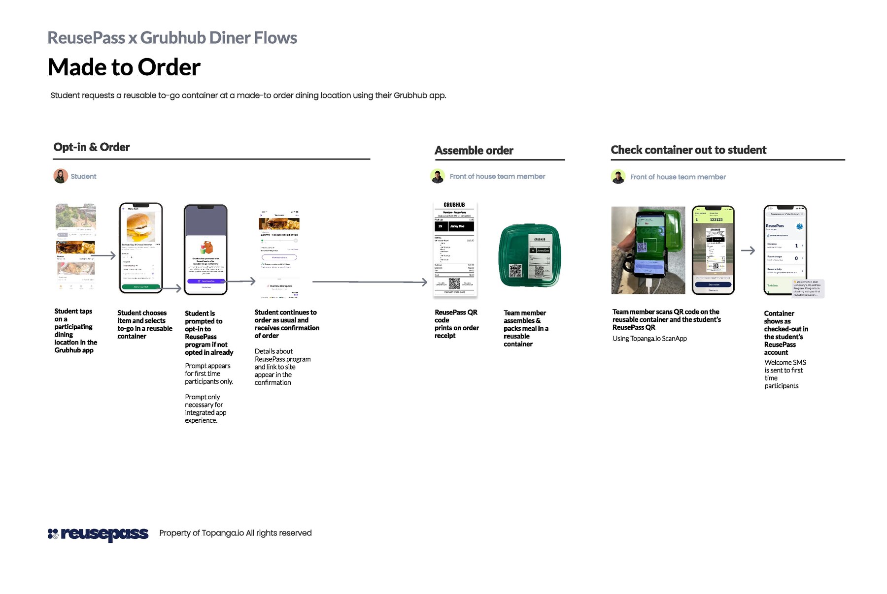
ReusePass x Grubhub diner flow diagram: opt-in and order, assemble order, and check container out to student
The made-to-order flow, end to end: a student opts in and orders through Grubhub, the front-of-house team assembles it in a reusable container, and checkout happens with a QR scan.

Note — on the return window

I ran user testing sessions with students to find the right way to frame the return window. The goal was to keep expectations clear while leaving room for operations to go wrong — a student shouldn’t be penalized if their container was actually returned but simply missed the scan-in.
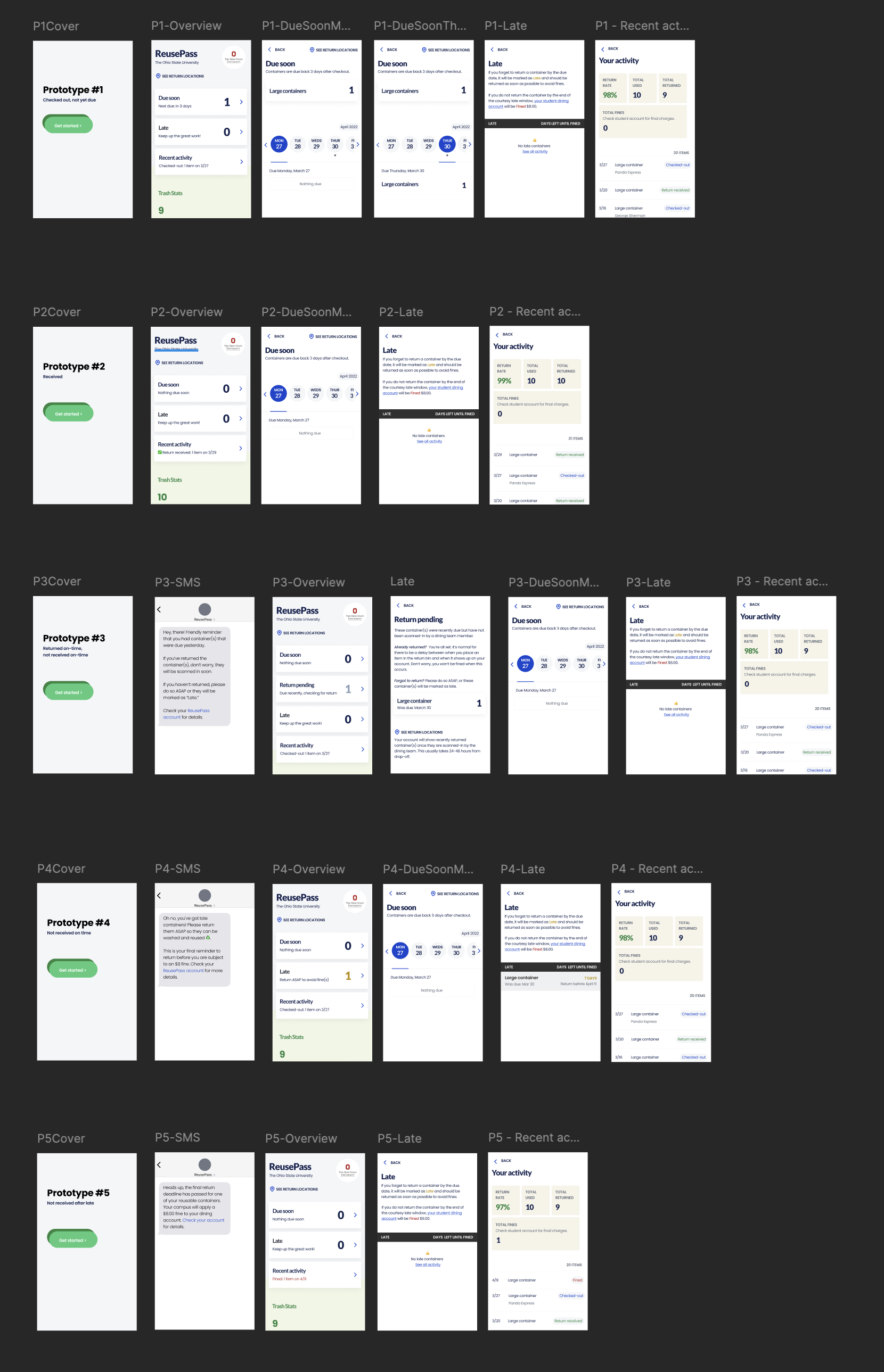
Five prototypes tested with students for return-window messaging, covering checked-out, received, returned-on-time, late, and returned-after-late states
Five framings tested with students, from a clean on-time return to a late one — including a “return pending” state so a missed scan didn’t automatically read as a missed return.
Experiments
Writing