Customer Experiences
Great products make the transition between physical and digital feel like magic.
Technology is at its best when it fades into the background.
These projects explore how digital products support the moments people encounter every day—from shopping and dining to making more sustainable choices.
Shopping Without Limits
Verizon Endless Aisle
Giving a smaller-format store access to a full retail catalog.
Shopping Without Limits
Verizon Endless Aisle
Giving a smaller-format store access to a full retail catalog.
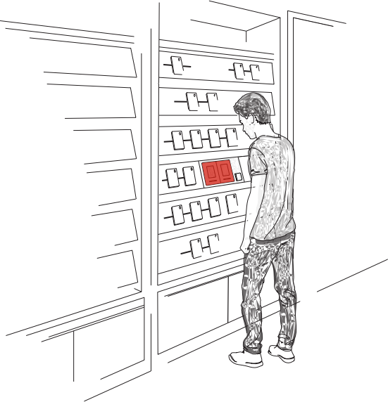
As Verizon introduced smaller footprint stores, reduced inventory came with a tradeoff: customers still expected the choice and confidence of shopping in a full-sized store.
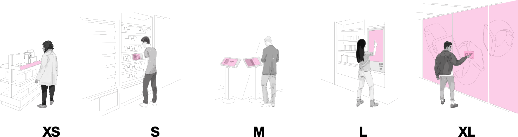
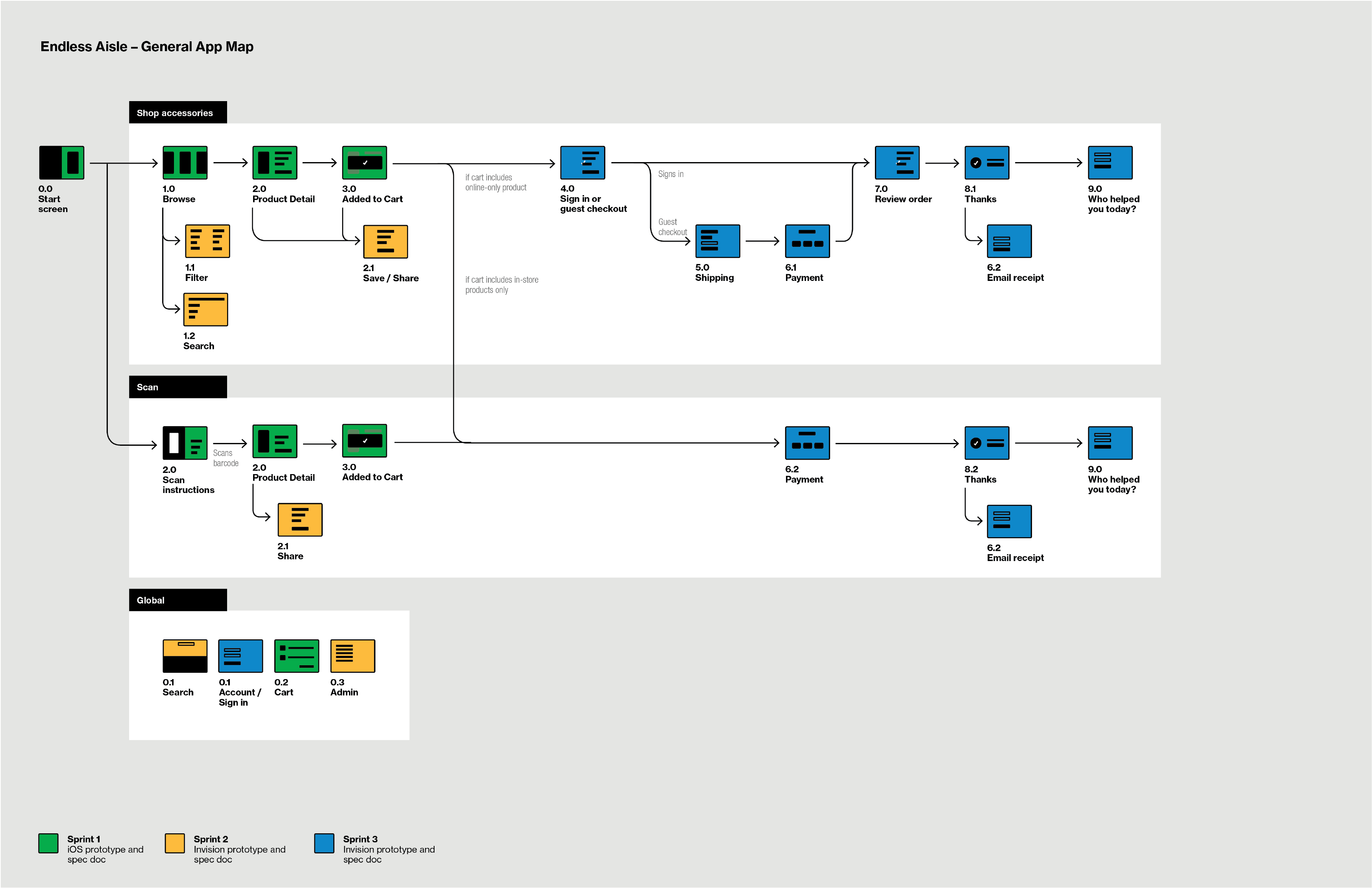
I designed Endless Aisle, an in-store shopping experience that gave customers access to Verizon’s complete product catalog without disrupting the physical retail experience. Rather than feeling like a website inside the store, the interface was built as an extension of the environment itself, mirroring the layout of physical displays and using interactions familiar to the space.
As the concept expanded, it grew into a family of products across multiple form factors, including a 96-inch interactive backwall, all built from a shared design system that adapted to different retail contexts.
Finding Your Salad
Sweetgreen Pickup Experience
Redesigning order pickup to keep pace with a surge in mobile ordering.
Finding Your Salad
Sweetgreen Pickup Experience
Redesigning order pickup to keep pace with a surge in mobile ordering.
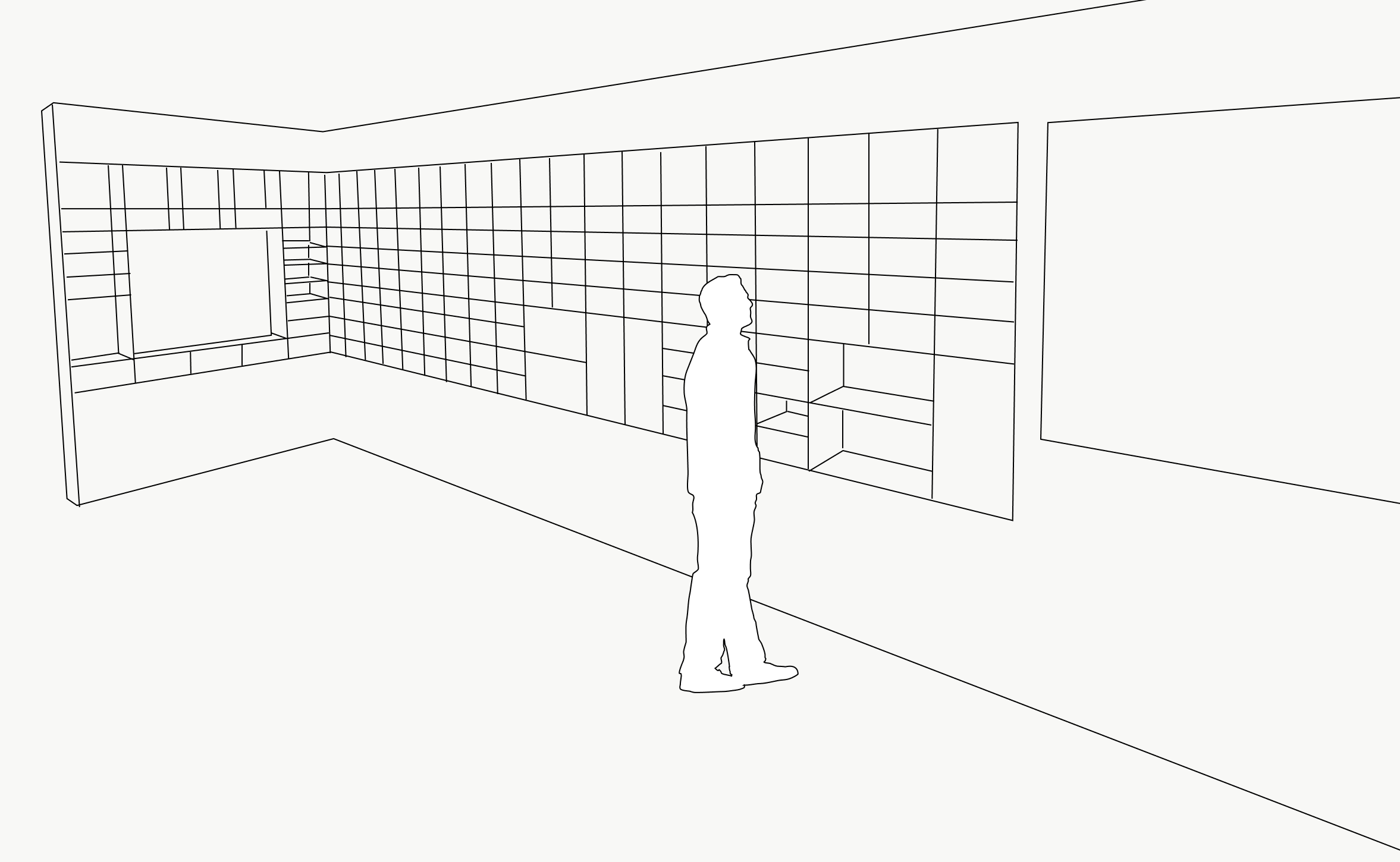
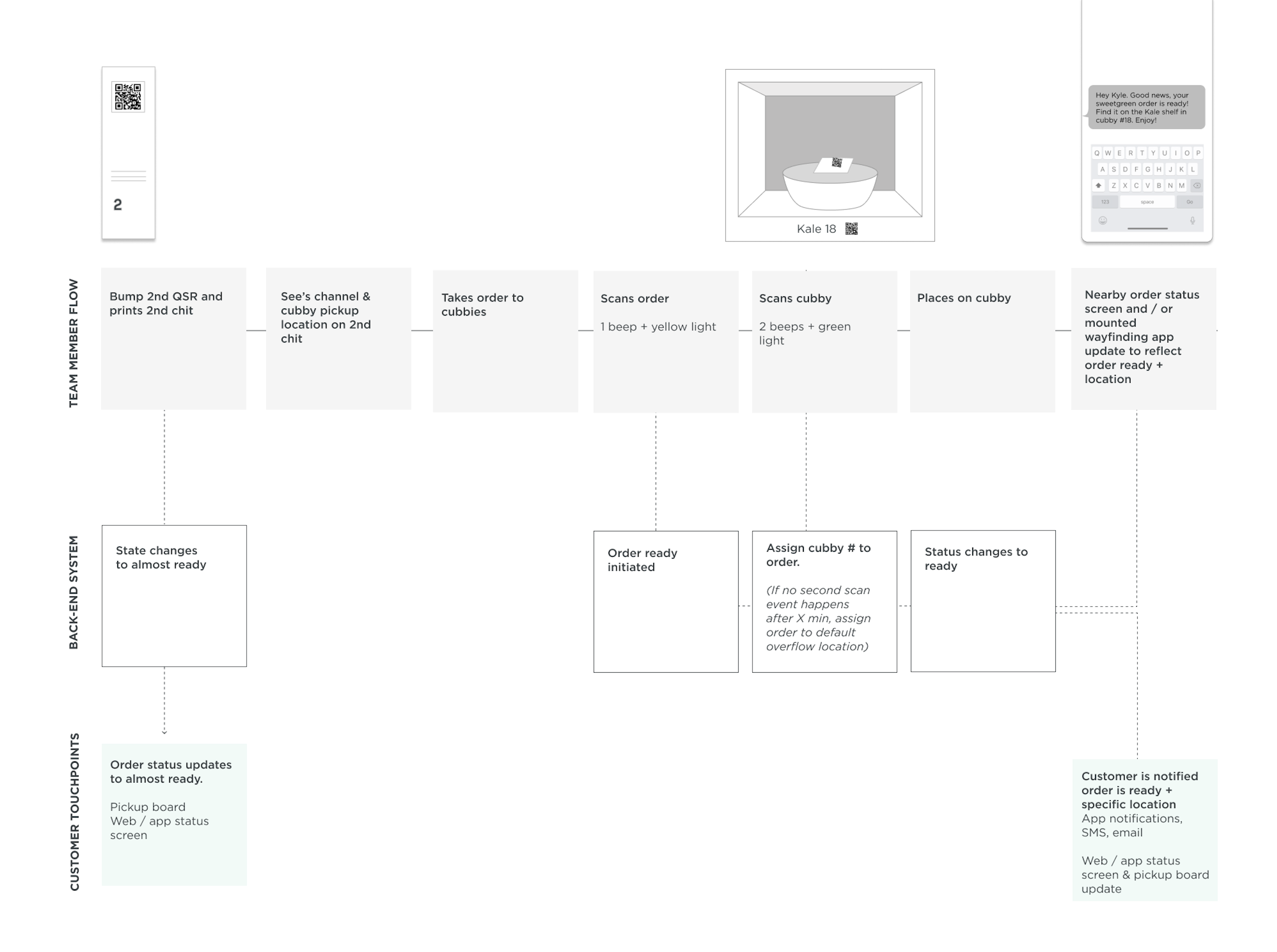
As mobile ordering grew during COVID, finding a completed order became a source of friction. During peak lunch hours, a single restaurant could have more than 100 salads waiting for pickup within a fifteen-minute window, creating congestion for customers and delivery couriers alike.
I led a discovery project to explore how customers could find their orders faster, and how pickup could work more efficiently for restaurant teams. The concept we landed on assigned each order to a specific pickup cubby, communicating its location through the order-ready notification, the mobile app, and an in-store digital display.
Making Reuse Feel Effortless
ReusePass App
Designing a borrow-and-return experience that helped customers build better habits.
Making Reuse Feel Effortless
ReusePass App
Designing a borrow-and-return experience that helped customers build better habits.
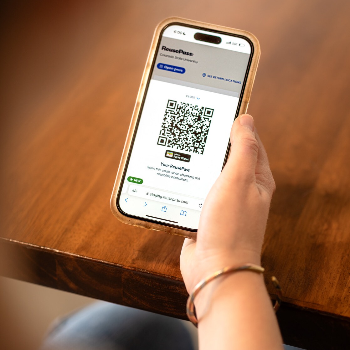
Reusable packaging only works if borrowing and returning feels as easy as throwing something away.
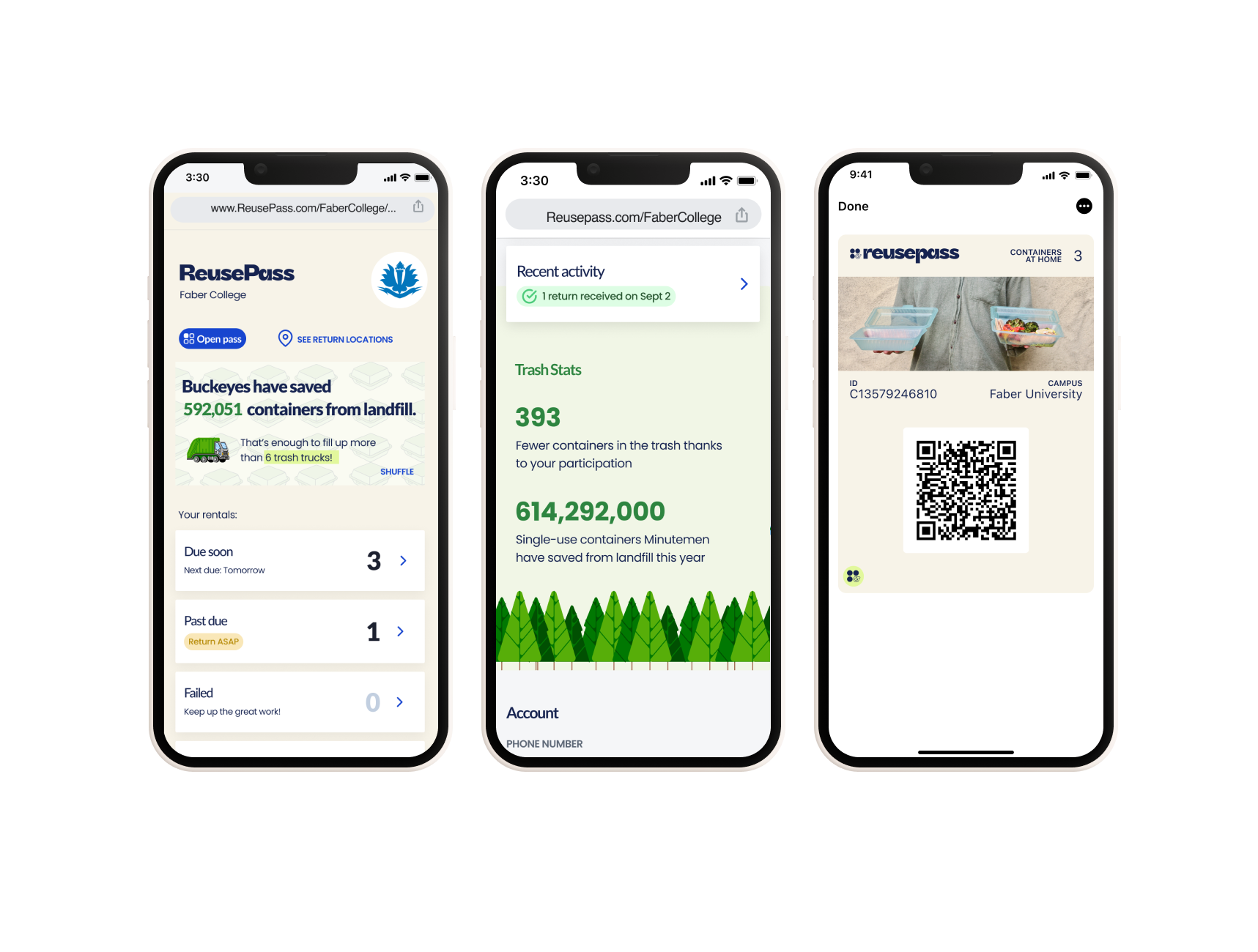
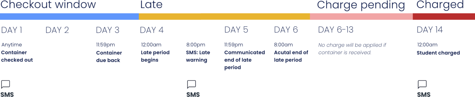
As Topanga’s second employee, I helped build ReusePass from the ground up, designing the end-to-end experience for borrowing, using, and returning containers across university campuses. Every interaction was designed to reduce friction, from sign-up in busy dining halls to reminders that encouraged students to return containers on time, helping students build lasting habits without adding work.
Discovering the Value of Apple Watch
Apple In-Store Activations
Helping customers understand what Apple Watch could do for them, before asking them to buy one.
Discovering the Value of Apple Watch
Apple In-Store Activations
Helping customers understand what Apple Watch could do for them, before asking them to buy one.
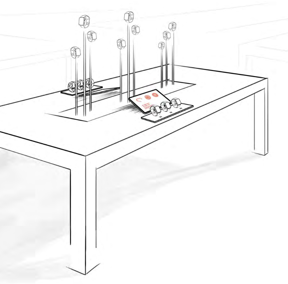
For many customers, the biggest barrier to buying Apple Watch wasn’t choosing a model. It was understanding why they needed one. Research showed that shoppers often saw Watch as another iPhone worn on the wrist, rather than a product with its own reasons to own it.
I helped shape an in-store experience that let customers explore Apple Watch through their own interests and goals. Rather than leading with features and specifications, the experience helped customers see how Watch could fit their daily life before guiding them toward the model that matched their needs.
Understanding how people move through the world is key to building great products.